

Big Paws
An Ecommerce specialty pet store catering to large dog breeds.

The Problem
Finding reliable goods for our large canine buddies can be frustrating as the current market caters mostly to small & medium sized dogs.
The client wishes to diversify her income options. The Big Paws concept took shape when she overheard some people at the dog park complaining about the lack of online resources for their large pups.
My services were engaged to conduct UX research and produce concept designs for an e-commerce website & mobile app.
The Goals & Challenges
The goal of Big Paws is to provide one stop shopping for users with dogs seventy-five pounds or larger.
Customers want to see reliable reviews of products that can withstand wear and tear.
For many dog owners, the internet is their primary source of information. It is important to have a site that is easy to navigate, optimized for a variety of devices, and provides customers with the products they need.
The Following Steps Were Used To Develop The Products
I divided my game plan into 5 distinct phases following a Human-centered design thinking process.
-
Competitor Research
-
User Interviews
-
Create User Personas
-
User Journeys
-
Low Fidelity Sketches
-
Wireframes & Prototyping
-
Testing
-
High Fidelity Prototype

Research
-
Per the 2017-2018 APPA National Pet Owner's Survey, 35% of USA dog-owning households have large dogs.
-
There are several online pet stores, but few that address the needs of large dogs in a comprehensive manner.
-
Chewy, Petsmart, and Amazon sell to all types of animals. While they do have inventory for large dogs it can be a quest to find the right product.
User Research
Five people were interviewed who have
seventy-five plus pound dogs. Key findings include:
-
They purchase online as well as at brick and mortar businesses
-
They lean slightly towards online shopping due to its convenience
-
They also like the experience of taking their dogs in store to choose their toys
-
Online shopping would have a slight advantage if free shipping and returns were included
-
Frustration with online sites claiming a product is for larger dogs but when they check the product description it is clearly for smaller dogs
-
They need durable products that can entertain their dogs without disintegrating into a cloud of fluff while the customers are away from home
An interesting point was made by one participant who has a handicapped relative. The site should address accessibility for users who have large service dogs.
Pain Points
-
Users have to hunt for inventory for big dogs on popular animal sites
-
There are not enough options for large dog breeds
-
Buying items based on reviews, but they tend to focus on smaller breeds and sometimes the items can't withstand large dog exuberance
User Personas
Based on the interviews two personas were crafted reflecting the users needs and pain points. The primary needs are:
-
A rating system that allows users to leave comments about products
-
An efficient checkout process
-
Images that show plus sized pups using the products


Cute intermission for all you big dog lovers
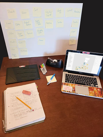
Sketches
Before hitting Adobe XD I sketched an outline to help visually conceptualize the website then the app.


Sitemap
The flowchart allowed us to follow a user's journey through the app making sure there were no dead ends.

Wireframes
I began to translate the sketches using Adobe XD. Below are some of the artboards.


Building the wireframes was helpful in exploring different design possibilities. From each iteration I was able to develop a stronger, more efficient user experience.
After user testing of the wireframe mockups, we discovered that some users found the site "too busy". So we pared down and streamlined the site.


Using the color palette helped us see how the site and app may look developed.
Having the capability to show multiple options to the client for feedback was invaluable.
Iterations
Some early mockup iterations are pictured here. After some discussion it became clear which looked and suited the client best.
After advanced usability testing, we learned which features worked best for our users and received valuable feedback on which designs were most striking and appealing. People thought the dog paw review icons were a "great" touch.
Clarity for each page was of utmost importance. Adding extra space and padding to the images created a cleaner product.


Overall the feedback was incredibly useful to the refinement process. Through varying product image sizes and layout of the page the design was able to stay cohesive from desktop to mobile.
Mockups
Using the client information and user feedback these mockups were created.
The main focus was for the overall look to be fun, clean, and easy to navigate. The photos of dogs in each category on the home page help connect the audience to the product and provides further incentive to view the page.
A slightly larger scale was used for accessibility viewing. The user research showed that many pet websites use smaller images and text which requires users to use the magnify option.
The main navigation bar is responsive. To maximize the space on the screen for products the navigation bar shrinks as the user scrolls. It remains useable and accessible at all times.
It was learned that having the search bar visible at all times is far more helpful to users than simply showing a search icon.
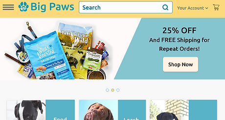


The adoption stories feature was important to our client as a morale booster and a learning tool. The more people can see happy adoption stories the more likely they are to spend on the site and beyond that the more likely they are to support shelters and local programs.


Mobile Mockups


The mobile images were a fun and challenging addition to the project. I enjoyed designing them so that it would stand out on it's own as an app while still looking cohesive enough to tie it in with the website.
There is less on the screen compared to the initial designs for easier viewing. I also took into consideration how people like to swipe (horizontally vs vertically) for certain objectives and integrated that into the layout.
TITLE OF THE CALLOUT BLOCK
RESULTS
Today people are more invested in their dogs than they have been in the past. The pet industry is continuously growing, but is dominated mainly by smaller dog owners. Big Paws addresses this discrepancy in an engaging, efficient manner.
Designing the Big Paws app was a challenging and gratifying experience. I was able to extrapolate the needs of the users through one on one interviews. From there creating an app that was engaging and addressed these needs became the main goal.
User research confirmed that there is a strong desire for someone to explore the large dog shopping niche. The users were particularly excited about having all their canine needs met on one application with clear product reviews and easy checkout.
I would suggest to the client that an eco-friendly category could take advantage of consumers who want environmentally friendly products. An additional feature that would be useful is making sure the site is accessible for those with service dogs.