

CARE 2 GIVE
Donating to the non-profits of your choice is easy!
Why Care 2 Give?
Type of Project
Mobile UX Design
My Role
Lead UX/UI Designer
Tools
Adobe XD, Adobe Photoshop, Adobe Illustrator, Paper, Pencils, Pens, Markers, Excel, Word
Deliverables
UX Research, UI Design, Wireframes, Mockups, Personas, Prototypes
Design a charity app that is easy to use and visually appealing
Care 2 Give was born out of a desire to design a modern, efficient app that allows people to easily donate to their favorite charities.
Problem
You want to donate to a cause that you believe in but the current apps are uninspiring, confusing and look like they were developed back in the 1990s.
Produce an app that is a joy to use and look at. This in turn might inspire people to give more frequently to charities.
Goals
Participants were given the task to go through the donation steps on a charity app.
User testing identified that the most common pain points were ease of use and lackluster presentation. These common difficulties and user impressions informed our development decisions.
Pain Points
-
The links to the charities were not clear enough
-
Confusing navigation is a major pain point when donating
-
Complicated and unorganized process
-
Uninviting and outdated layouts
-
Recurring donations should be easy and secure
"It was kind of dull and listless" -test participant reviewing competitor app

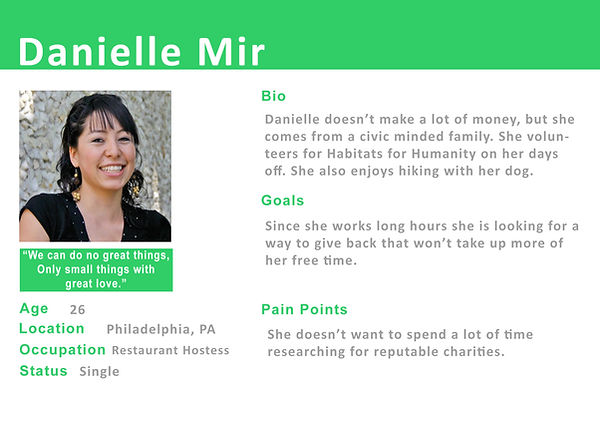
A persona evolved that kept the user's needs at the forefront of our design decisions
Danielle is the type of person that cares about the world and wants to make a difference. However, due to her busy schedule, she does not have the time to volunteer. Her best option is to donate online. The problem is that she is overwhelmed by the entire process. The sites are confusing, unorganized or do not inspire genuine emotional connections to the causes.
User interviews via Google Hangouts were conducted with 5 participants to find out what thought processes are involved when donating money. An empathy map was sketched to keep in touch with the user's needs and priorities.
UNDERSTANDING THE USER
Sketches
This app is geared mainly towards millennials and tech savvy individuals.

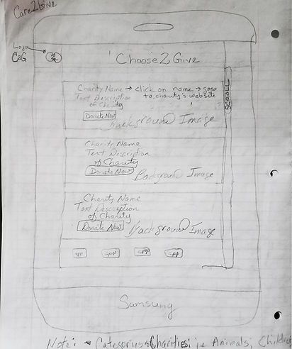
I started by sketching a few ideas while making notes about changes or possible fixes. Sketching and brainstorming helped define goals that would streamline the donating process as much as possible.
Notes written beneath some of the sketches provided clarification as ideas were formed during the process.
I had six participants go through the donation process for an online site(stopping short of actually donating) as I noted their impressions, thoughts, feelings, etc. Three struggled through the process. It was unanimous that the site was outdated and ugly.
Customer Impressions included:
-
"The site doesn't show me that they are passionate about the charities"
-
"It was kind of dull and listless"
The earliest design of the app was originally named Choose 2 Give. After further brainstorming and testing, Care 2 Give was the popular winner.
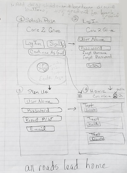
This design was streamlined for later versions of the app, but the main features were kept intact.
Below are more sketches that were used to flesh out the app.


An App to make giving back easier
By simplifying the donation process I hope to encourage people to donate with increasing frequency.
Looking for reputable places to donate can be a daunting task. Care 2 Give takes that stress away and gives the user the means to donate at their leisure.
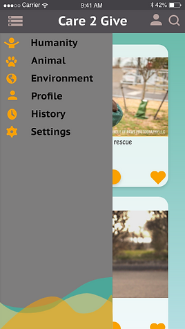
Sitemap

ON TO THE HIGH DEFINITION SCREENS!


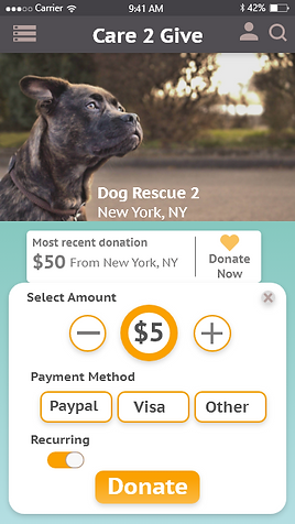
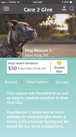


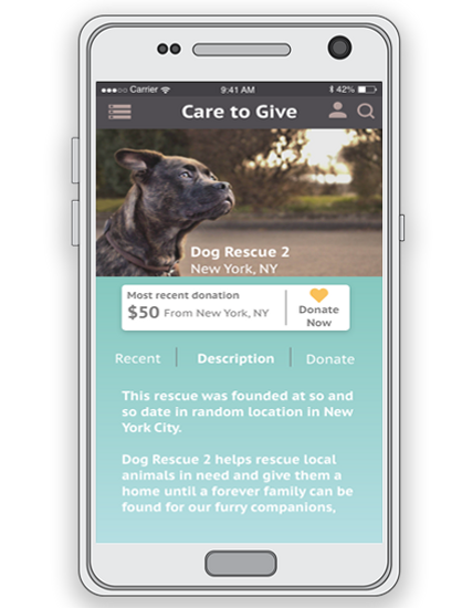
C2G Prototype
TITLE OF THE CALLOUT BLOCK
Reflections
There are many components to creating a donation app. What I found is that a swath of people are willing to donate money when it feels effortless.
While people would like to volunteer their services, many are so time crunched that it is just not possible.
Donating money through online apps is an option that allows people to feel involved in causes that are important to them. For the casual donor, this also allows them to feel philanthropic without over exertion.
This app went through a number of different iterations as plans were tested, changed or outright discarded based on user feedback.
Further development could add a quiz to provide a better sense of which charities align with their personalities/priorities. An additional sign up page can be added for people who wish to volunteer.
I would also delve deeper into increasing participation from the casual donors.